
Take one pharma company...
...and you understand one pharma company

Every year, one of the more noteable inputs to our Pharmaceutical Innovation and Invention Index is the Freshness Index - which looks at how much of our cohort’s revenues are from new drugs…
Everyone has a view - as soon as you wade through the management consultants who can only comment on how they’d have done the graphs differently, there are some fascinating insights. The most important for me is that there is no average pharma company. As soon as your eyes adjust to this chart, you’ll see past the more obvious small biotechs who only have one or two drugs, launched recently, you’ll see that even among the large companies, there are huge differences in how ‘fresh’ their marketed portfolio is (vs how much they’re reliant on older drugs). Look at the difference between J&J (which is traditionally a healthy company), where more than 95% of their revenue is from drugs launched more than 5 years ago, and Lilly, with almost 40% of its revenues from new drugs.
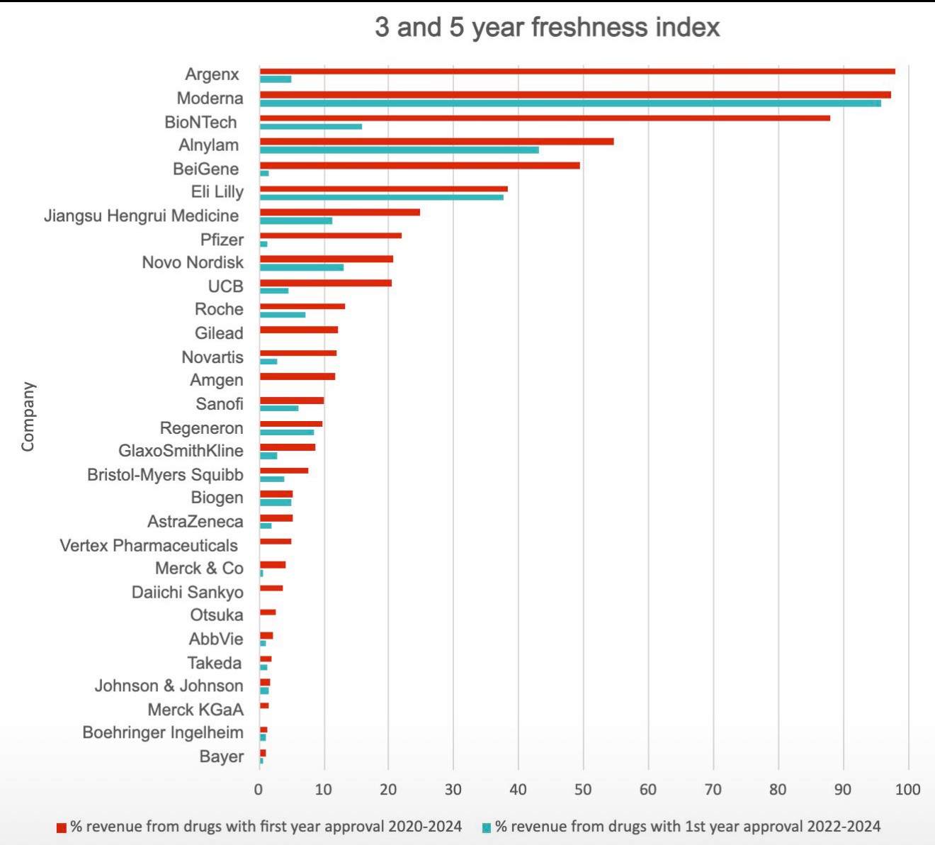
This shows a great deal of the innovation gap in pharma - launching drugs is clearly critical, but having them generate revenue is a consideration that’s often left too late.
I’ll admit that the next chart is from someone on X who didn’t like our chart, and it’s definitely better than ours… Thank you, Amit Kumar Goyal, @akgoyal on X…
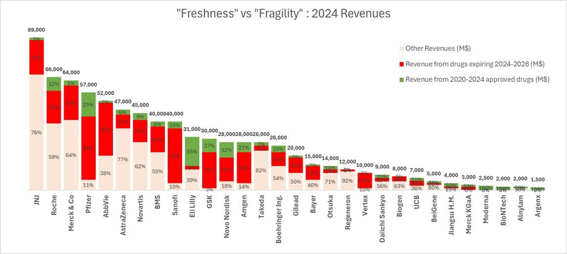
Here, we include the freshness numbers, but we include the converse - the drugs that are expiring in the next few years - a ‘Fragility Index’ if you like…
(Here’s ours…
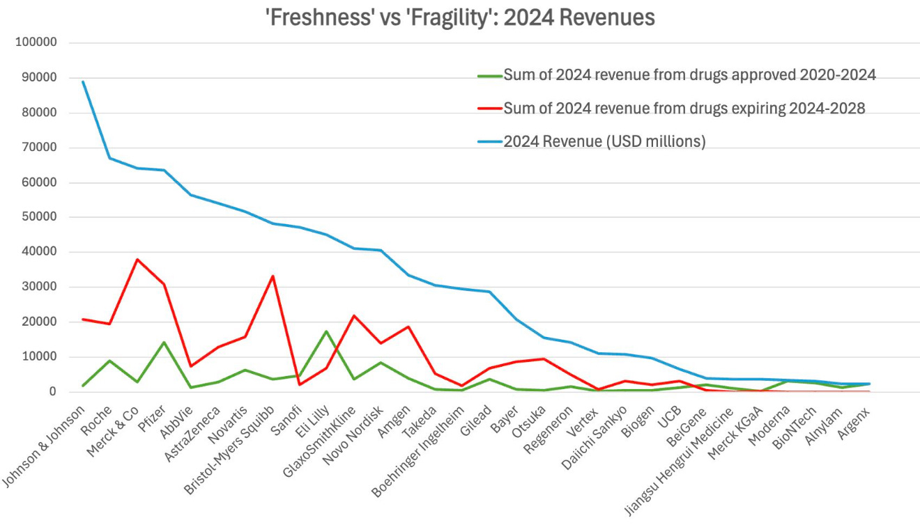
This balances the first chart a lot, as, for example, J&J’s sheer size (and we do include non-pharma revenues…) seems at odds with its Freshness Index…
I’ll wait to draw more from these until we have the overall index live (later this month…).